back to top

Grant thornton Sweden

Employer branding with a sense of self-irony

Challenge

In an industry long dominated by the “Big Four” and their aura of prestige, hierarchy and long hours, Grant Thornton faced the challenge of standing apart as a genuinely people-first consultancy. Despite an internal culture built on care, humility and collaboration, the external perception of the category was still one of elitism and outdated ideals. The world of work was shifting, younger generations were demanding balance, empathy and individuality, yet the consulting world lagged behind.

The challenge was to articulate and visualize a new kind of status in the industry: one defined not by sharp elbows, but by sharp ideas.

Response

The creative mission centered on a clear and bold concept: A different kind of firm.

Through insight, humor and a modern visual language, we set out to challenge the clichés and stereotypes of consulting, while celebrating Grant Thornton’s true culture of empathy, leadership and inclusion.

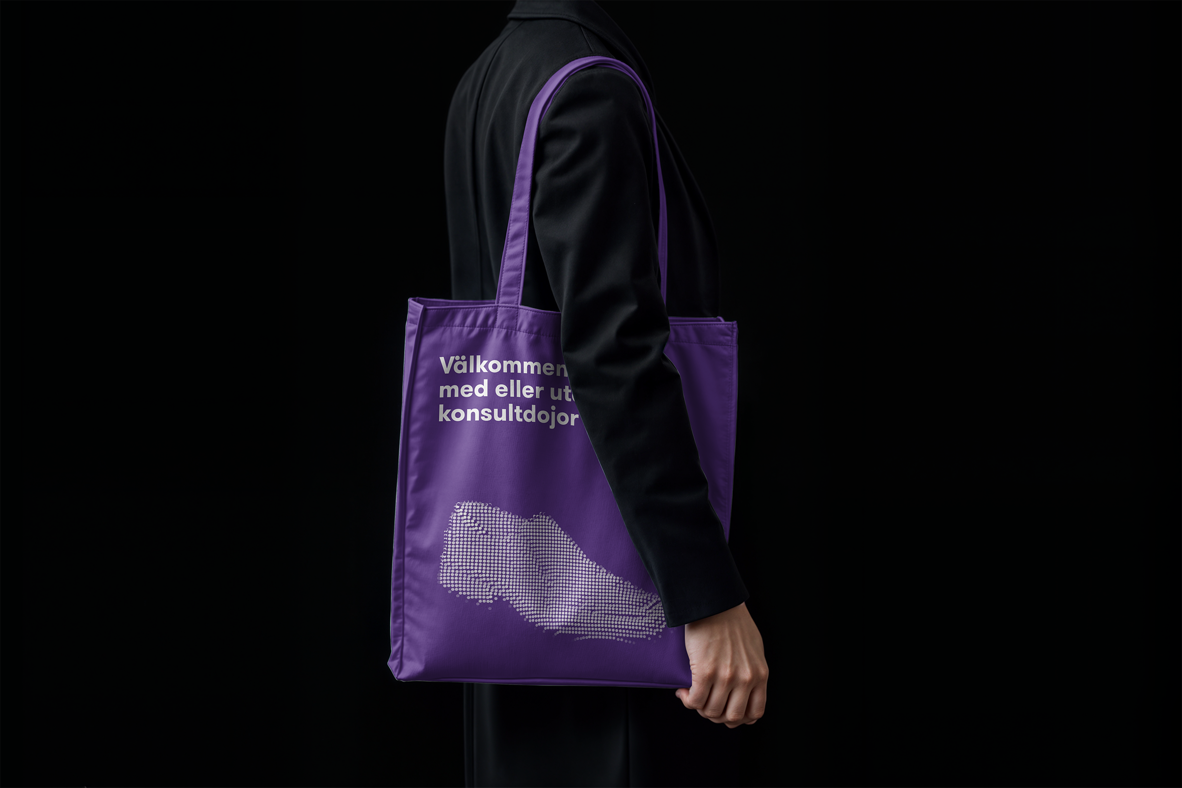
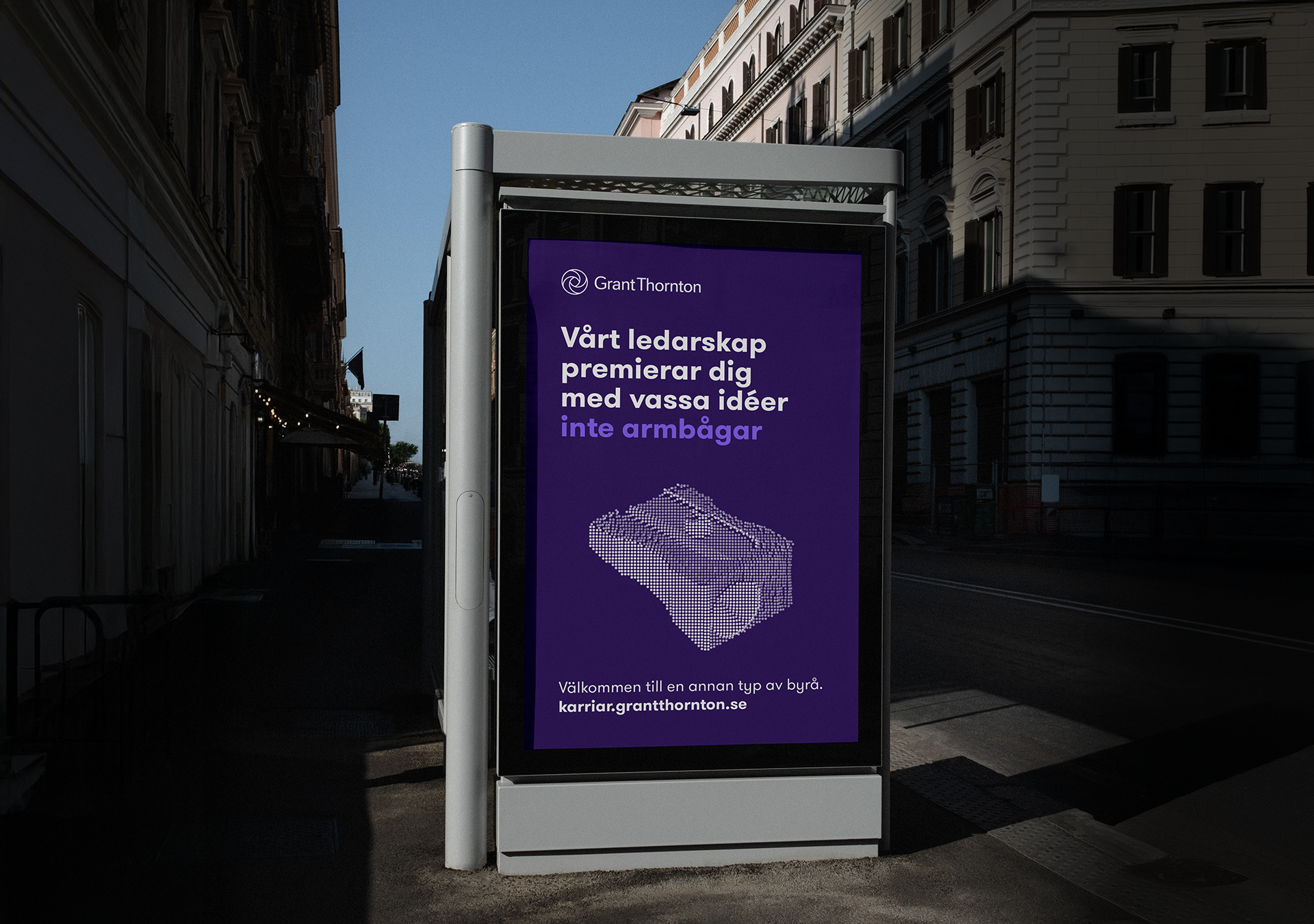
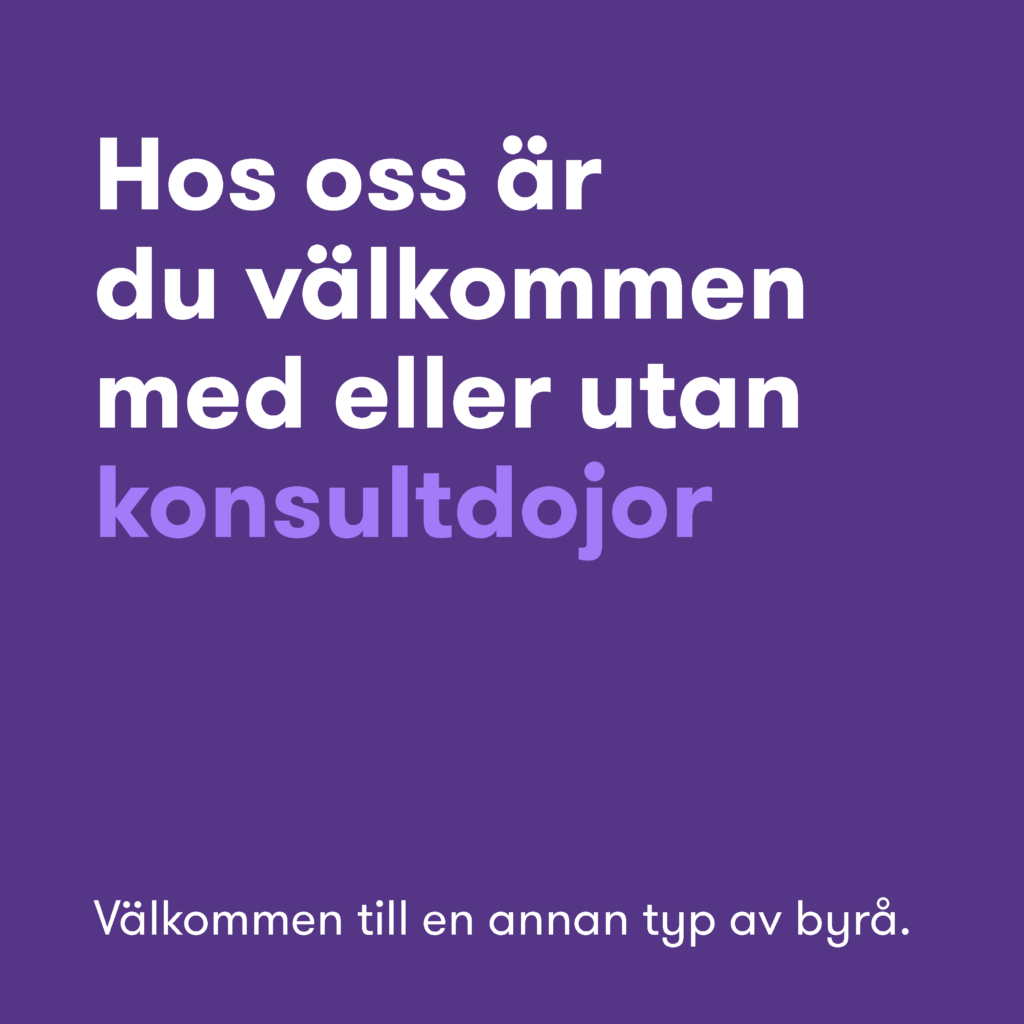
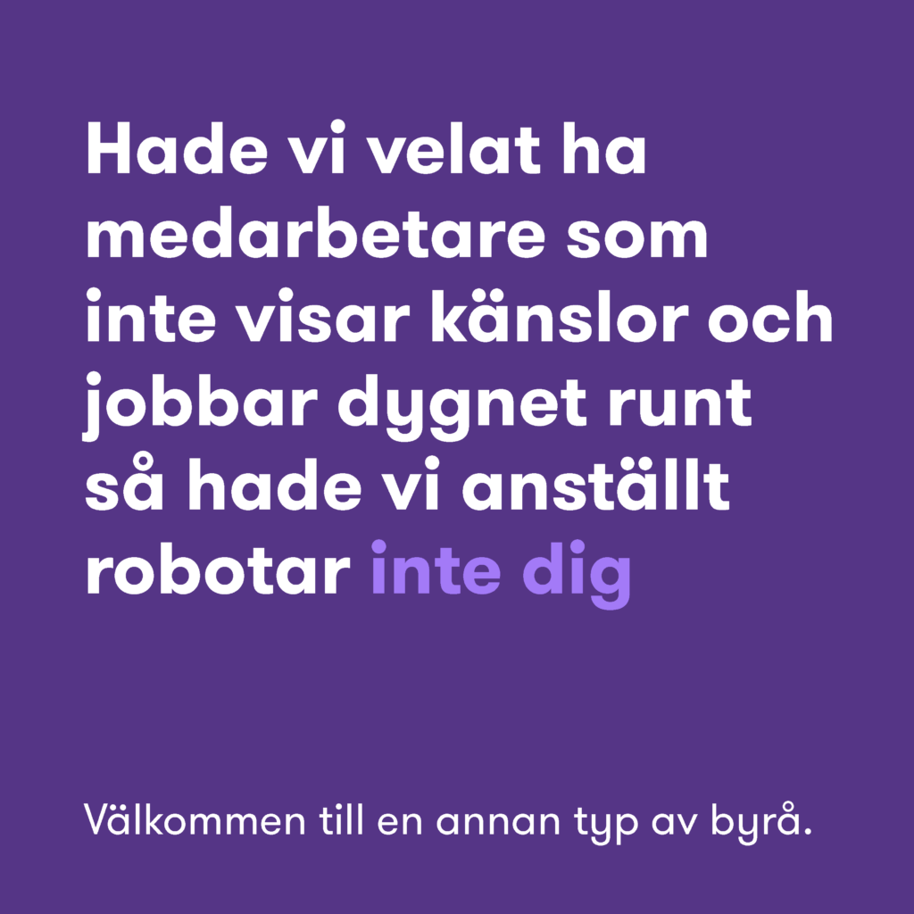
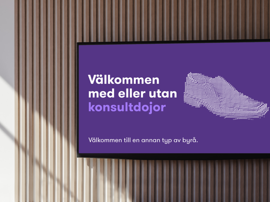
The campaign tone is insightful yet witty, allowing the brand to speak with confidence without arrogance. Copy lines such as “You’re welcome here, with or without your consultant shoes” and “We reward sharp ideas, not sharp elbows” express the brand’s challenger position with warmth and intelligence.

Design reinforces the message: a lilac color world, bold typography (GT Walsheim Pro), and bitmap-style illustrations inspired by spreadsheets and Excel columns give the brand its own distinctive texture. A nod to the analytical world, reimagined through a human lens.

Process

We explored several creative routes before landing on the final concept that truly set Grant Thornton apart from the Big Four competitors. Where others in the category spoke in polished corporate tones, we embraced imperfection and humor.
Where others used staged photography of skyscrapers and boardrooms, we chose illustrations and design metaphors to embody the softer side of professionalism.

The bitmap illustration style, drawn from everyday consulting tools, became a signature visual device, transforming something technical into something tactile and human. Combined with a confident use of Grant Thornton’s purple, this design system allowed the concept to live coherently across digital, social, and print media, while always feeling like a different kind of firm.

Impact

The campaign struck a deep emotional chord inside the organization. Employees immediately recognized themselves in the tone and visuals, proud to see their culture represented authentically and humorously. And even see themself act in the actual launch film watch here. The concept reframed what success looks like at Grant Thornton: collaboration over competition, empathy over ego.

Grant Thornton’s positioning as “the kind firm”, the one that values people as much as performance has strengthened its reputation among both current staff and new talent. By translating this spirit into a coherent and distinct design language, the employer brand now truly stands out — not as another Big Four, but as A different kind of firm.

My Deliverables

– Visual concept
– Art direction
– Design Strategy
– Illustrations
– Animation
– Launch campaign