back to top

Visit norrköping
(personal project)

BRANDING CONCEPT FOR NORRKÖPING’S CULTURE OFFERING

Challenge

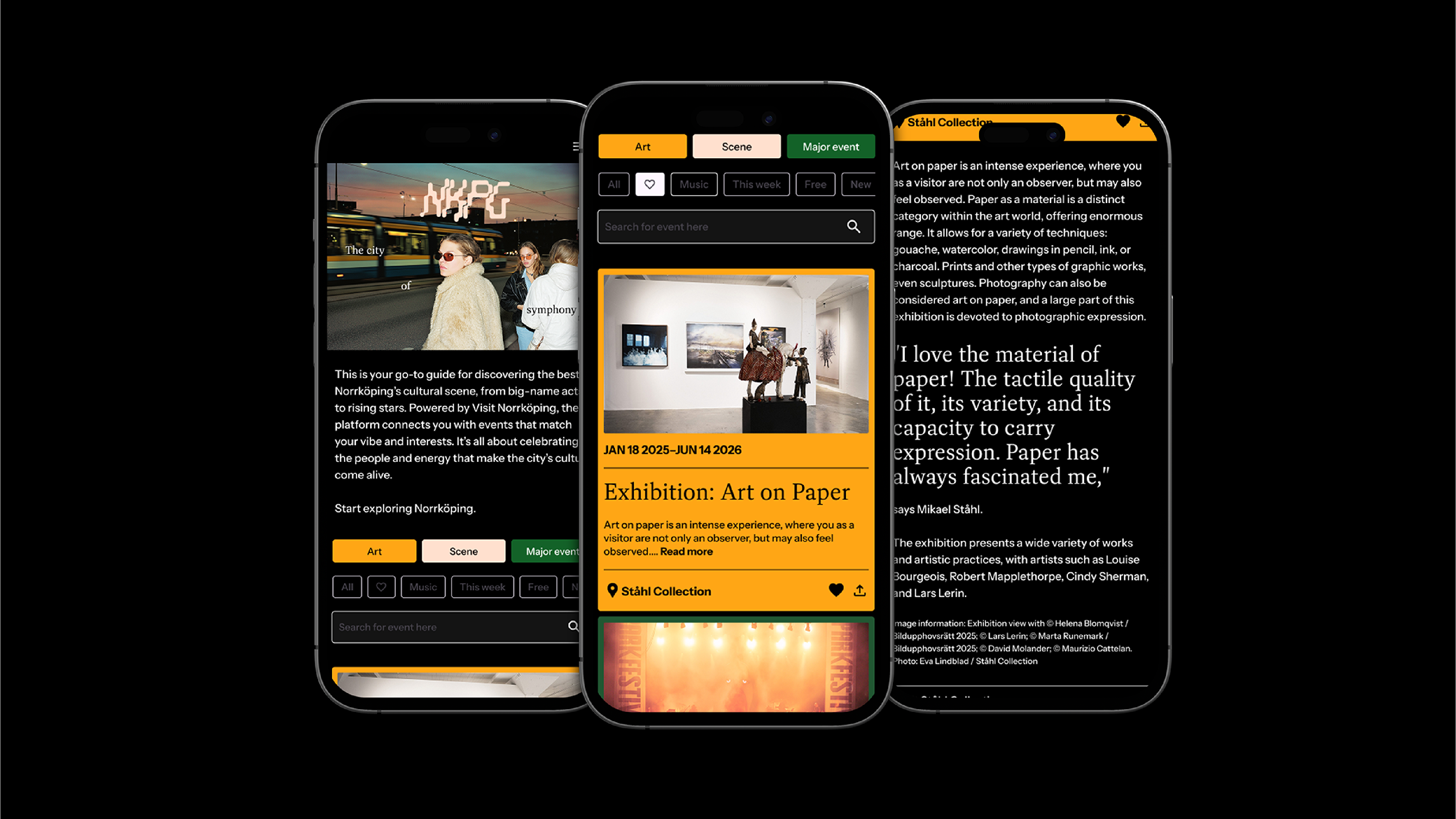
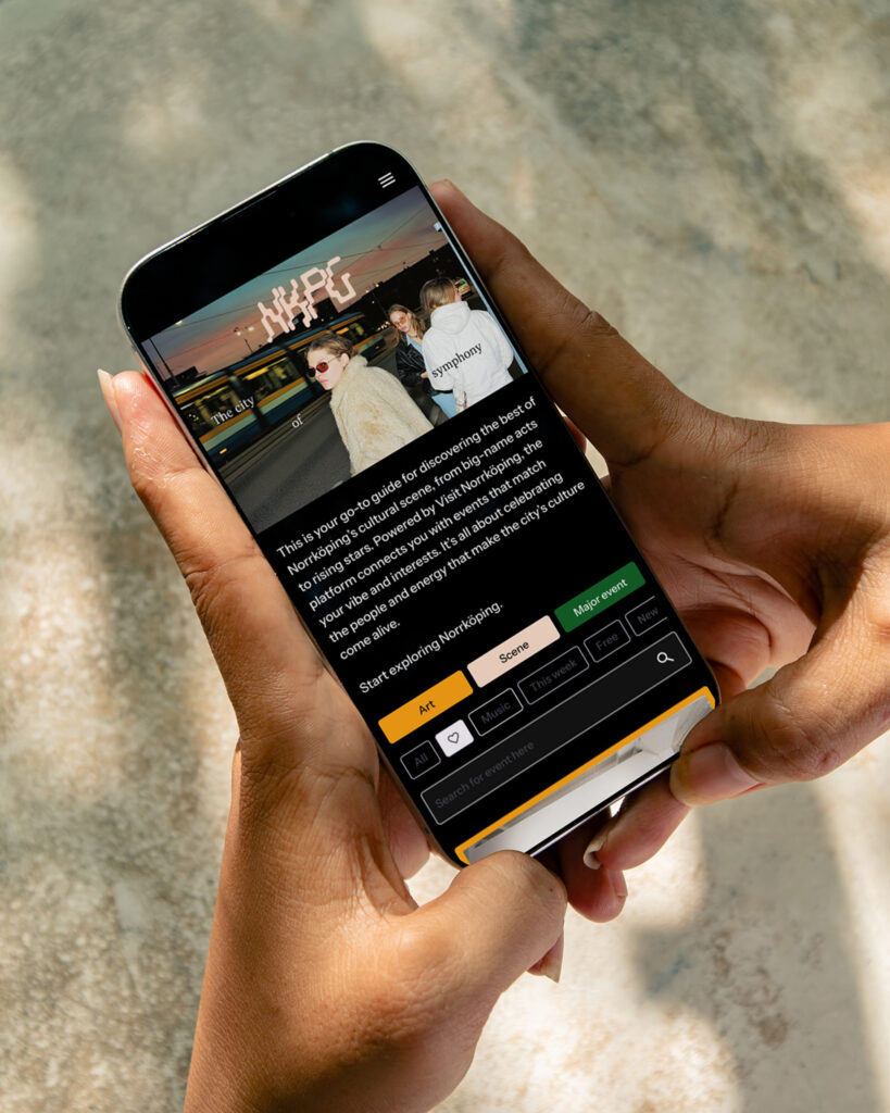
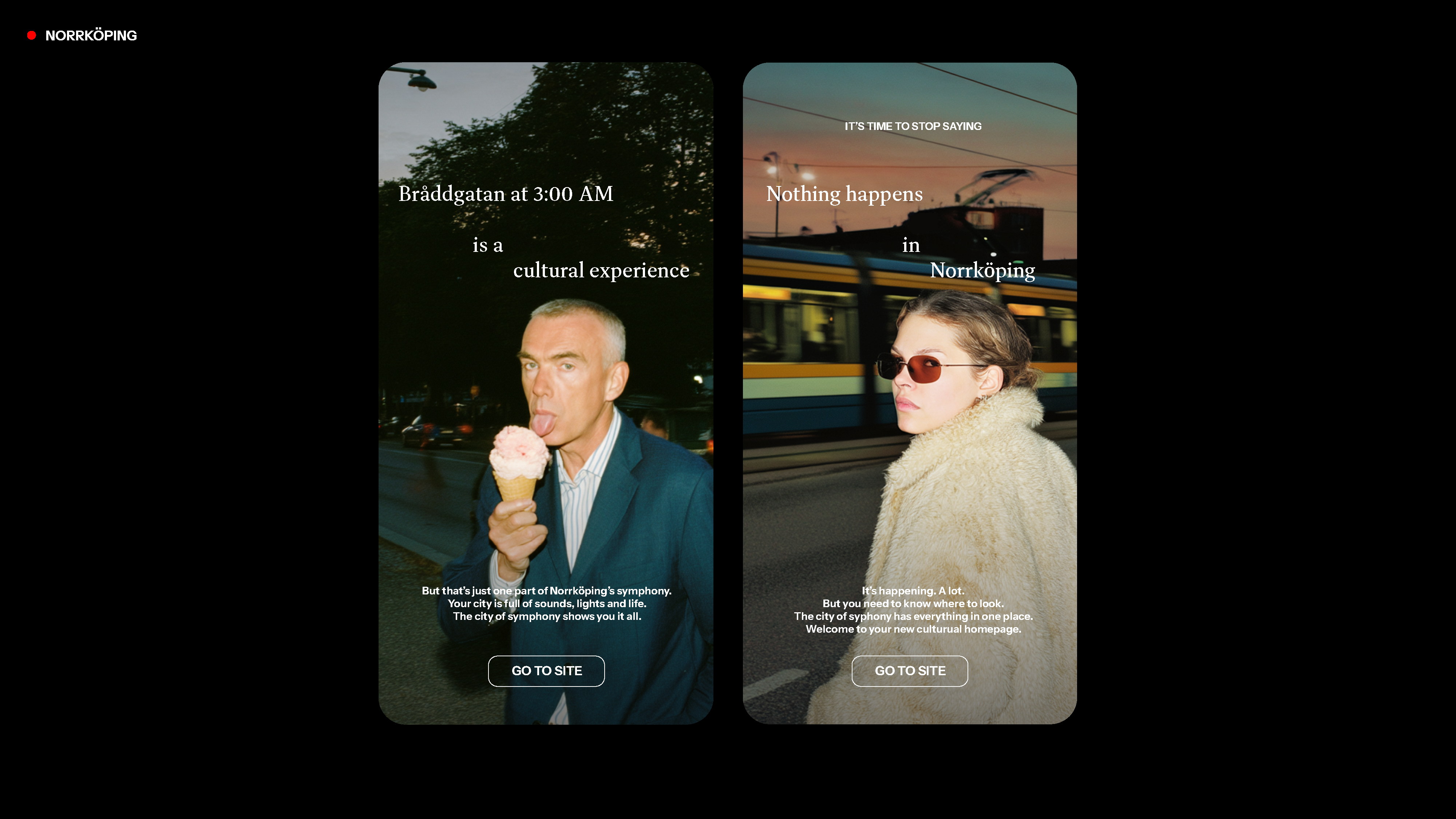
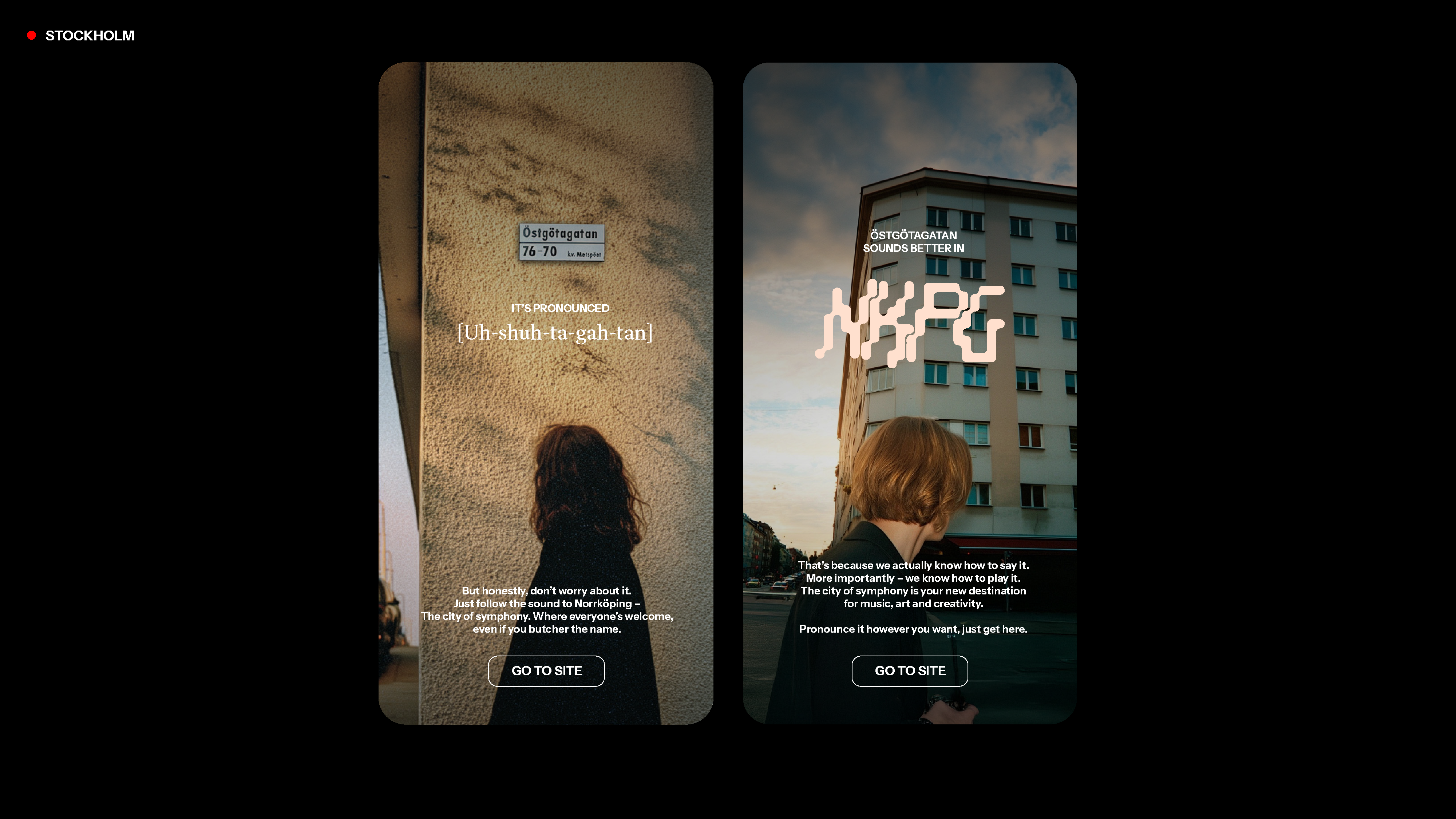
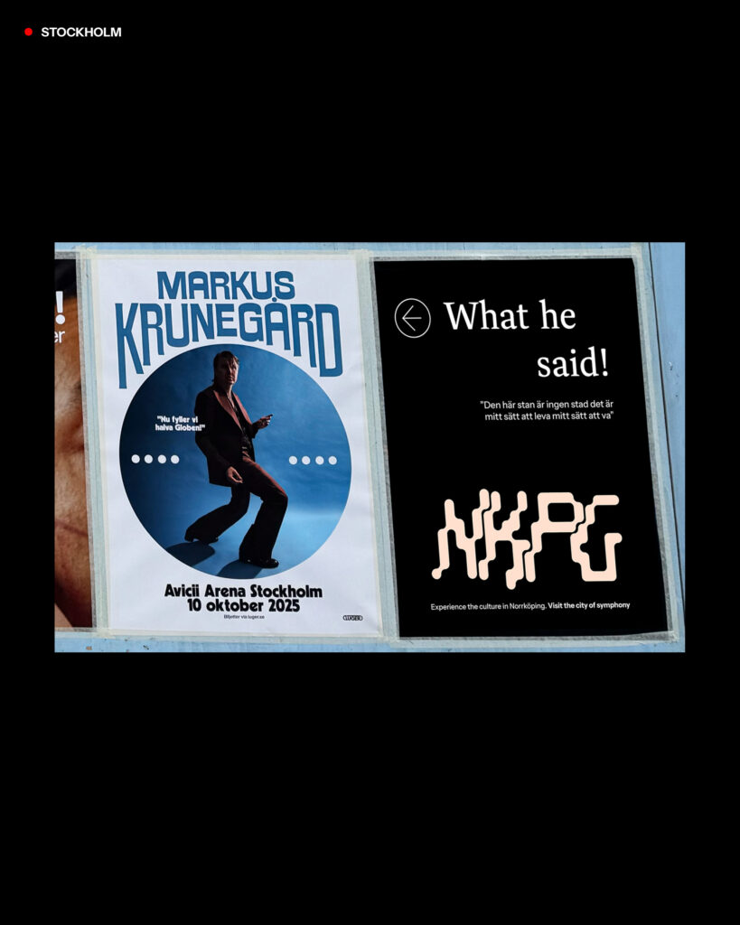
Norrköping has long been a city built on creativity — from the industrial era’s hum to the world-famous symphony orchestra. But despite its rich history, the city’s cultural offering had lost its rhythm, its stories failing to reach people through a communication that no longer resonated. Existing channels were fragmented and uninspiring, and the conversation around culture had turned defensive. Visit Norrköping needed a way to reclaim pride and show that the culture here isn’t fading, it’s evolving.

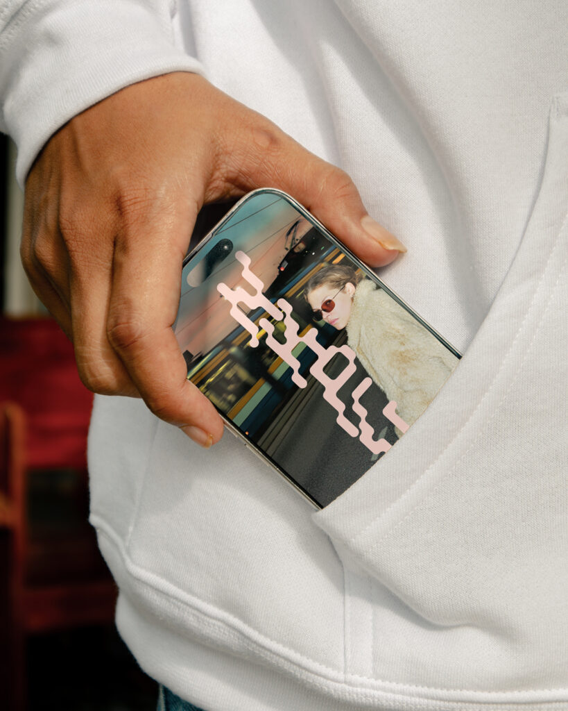
The task was to repackage Norrköping’s entire cultural offering into a single, living platform. One that could inspire locals, attract visitors from Stockholm, and reflect a modern, creative city with its own beat. The challenge wasn’t just strategic, it was emotional. The design had to rebuild trust and pride through a voice that felt bold, human, and unexpected.

Response

The answer became “Norrköping — The City of Symphony”. A concept that turns a familiar word into a symbol of collective creativity. The symphony doesn’t just refer to the orchestra, but to every pulse that shapes the city, from trams and street sounds to concerts, art, and nightlife.

Visually, the platform merges Norrköping’s industrial past with its creative present. The selected colors are a stripped-down palette of Norrköpings main color library with black, white, and soft tones which lets photography take the lead. Real people and everyday scenes bring authenticity to a city-owned platform that feels personal and alive. The digital experience is mobile-first, intuitive, and inspiring, designed to make discovering culture as engaging as being part of it. 

The new NKPG logotype is based on the old logos concept, the flowing stream and smoke pillars rising from the industries, which are the hallmarks of Norrköping, put in a more urban context. The evolution also showcasing the musical history of the city by the connotation to sounds waves.

Process

Three creative routes were explored, but one clearly resonated most: The City of Symphony. It was both poetic and proud, expanding the orchestra’s legacy into a metaphor for the entire city. In testing, people described it as “the strongest and most scalable” and said that “Symphony feels Norrköping.”

The design process focused on creating a flexible system that could grow over time. Being time and money efficient within the a limited budget that is usually the case for municipal communication. Documentary-style photography, minimal typography, and a tactile color palette created a raw, human aesthetic that contrasted traditional municipal communication. The result is contemporary, emotional, and grounded in place, a visual rhythm that people could recognize as their own. Also, a contrast to the usual traditional municipal communication that could come across as dull or boring.

Launch

The launch captured Norrköping’s wit and confidence with a tone that felt both self-aware and proud. Headlines like “Nothing happens in Norrköping” turned into “It’s time to stop saying that.” “Bråddgatan at 3:00 AM is a cultural experience.” and “Östgötagatan sounds better in Norrköping.” brought humor and attitude to the campaign. It made the branding stand strong and relevant in the lounder external cities like Stockholm (which is just a short train ride away from Norrköping) while keeping it’s local pride.

The NKPG identity and tagline framed striking local photography, turning everyday moments into something cinematic. With design at its core, The City of Symphony reintroduced Norrköping as what it has always been: a city alive with sound, movement, and culture.