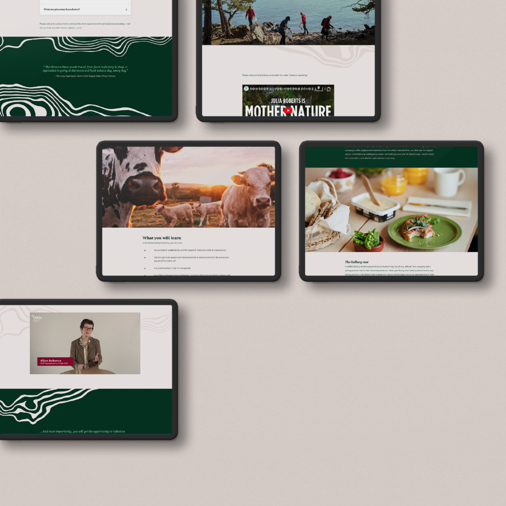
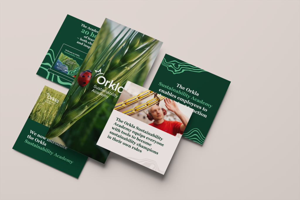
From the start, design played a central strategic role. Not just as aesthetics, but as a conceptual framework capable of holding a wide range of content, from scientific data to storytelling and reflection exercises.
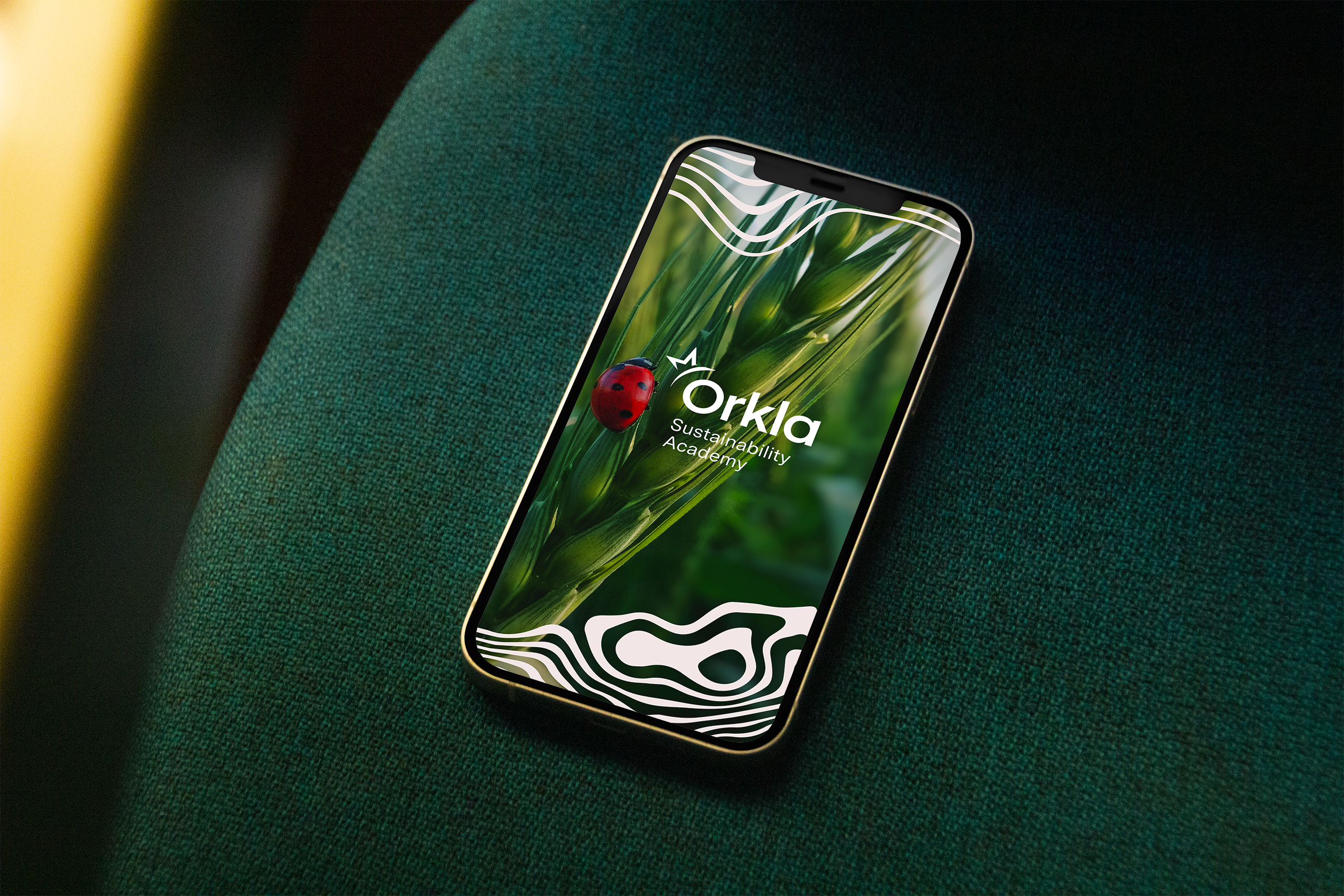
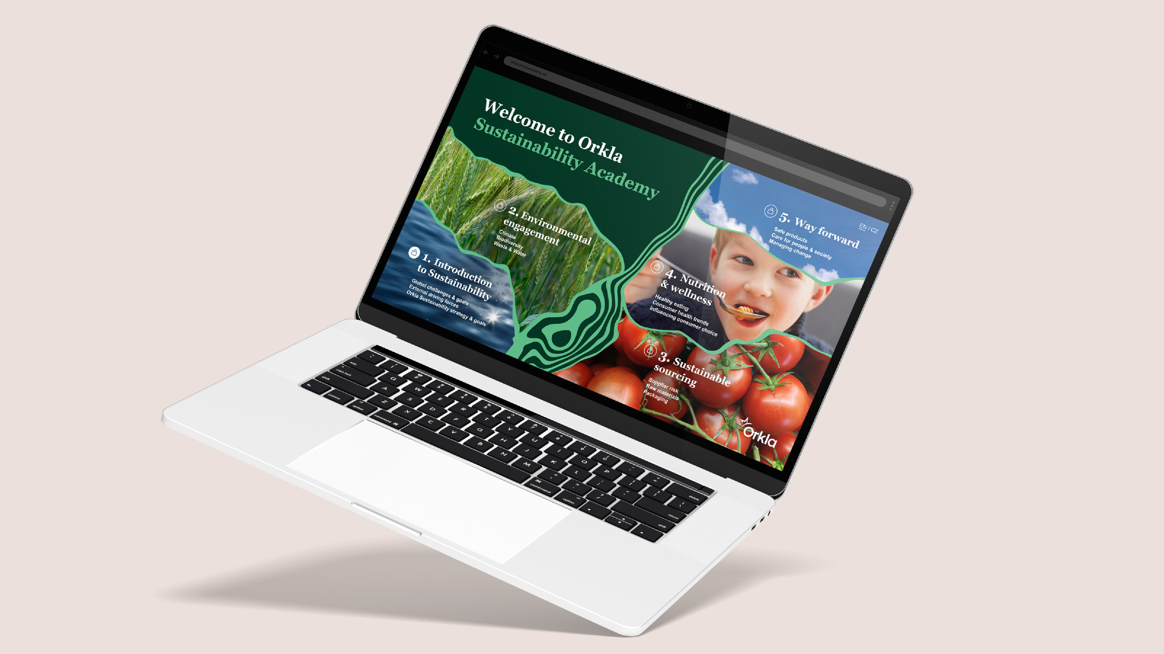
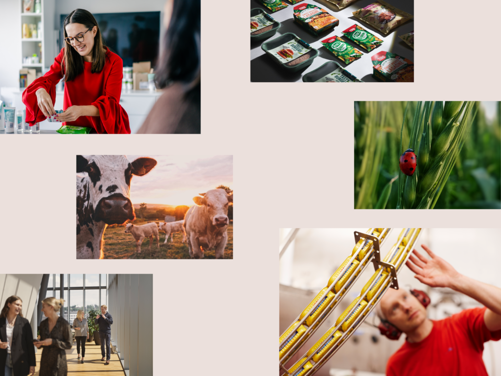
The process began with finding the core in Orkla’s newly updated brand identity and visual foundation and translate it to a visual concept for sustainability. Selecting colors from the main palette, brand typeface and imagery. The design challenge was to turn this highly tactile theme in to a 2D world on screen but keep the idea to visualize the healthy world.
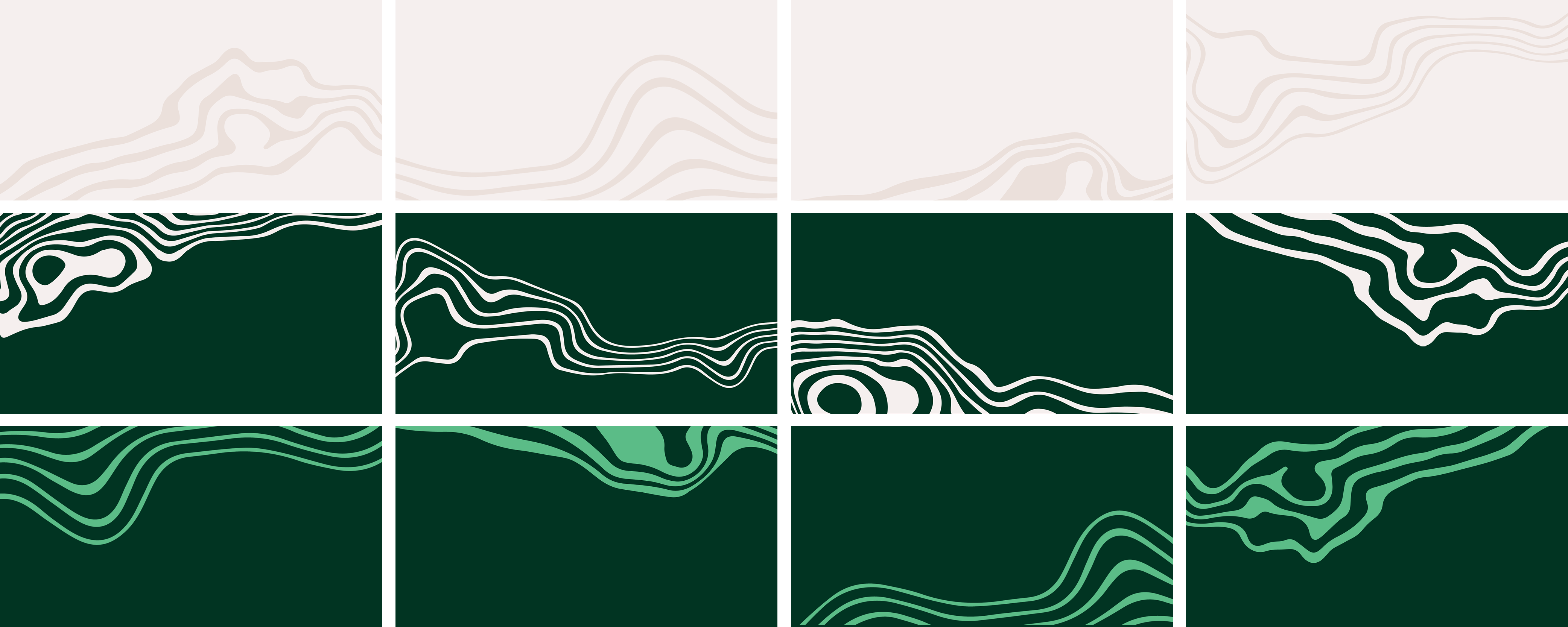
Inspiration started from nature’s way of doing things. It translated in a layered design language that could feel alive and adaptable in a digital context. Creating depth into the 2D world. We created a library of organic pattern that helped the learning system to become highly dynamic, in both function, decor and identity recognition.
Through iterative collaboration with the Orkla team and coders, the concept was continuously refined into motion design, layout structures, and visual principles that ensured coherence, clarity, and emotional engagement across every module and format.